Bao Express' Interior Evoke the Melancholic Feelings
The Canadian AC studio, which is famous for its characteristics– always features a minimalist side in every work. Recently, Ac Studio designed the minimalist interior of a Chinese restaurant known as Bao Express, located in the city of Markham, Ontario.
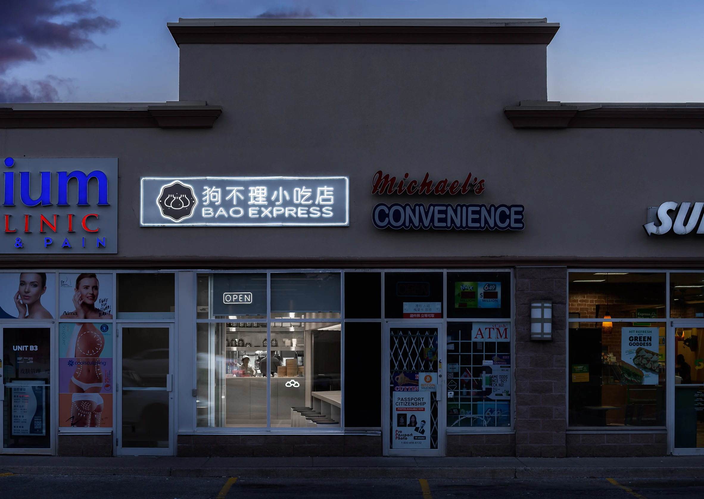 (Minimalism on Bao Express)
Bao Express carries a "fast-paced and efficient" identity as a guideline for AC Studios in carrying out the concept of minimalism. The minimalist concept of Bao Express is expected to provide an efficient dining experience and facilitate access to takeaway and delivery. All this is arranged through the interior layout to create good circulation.
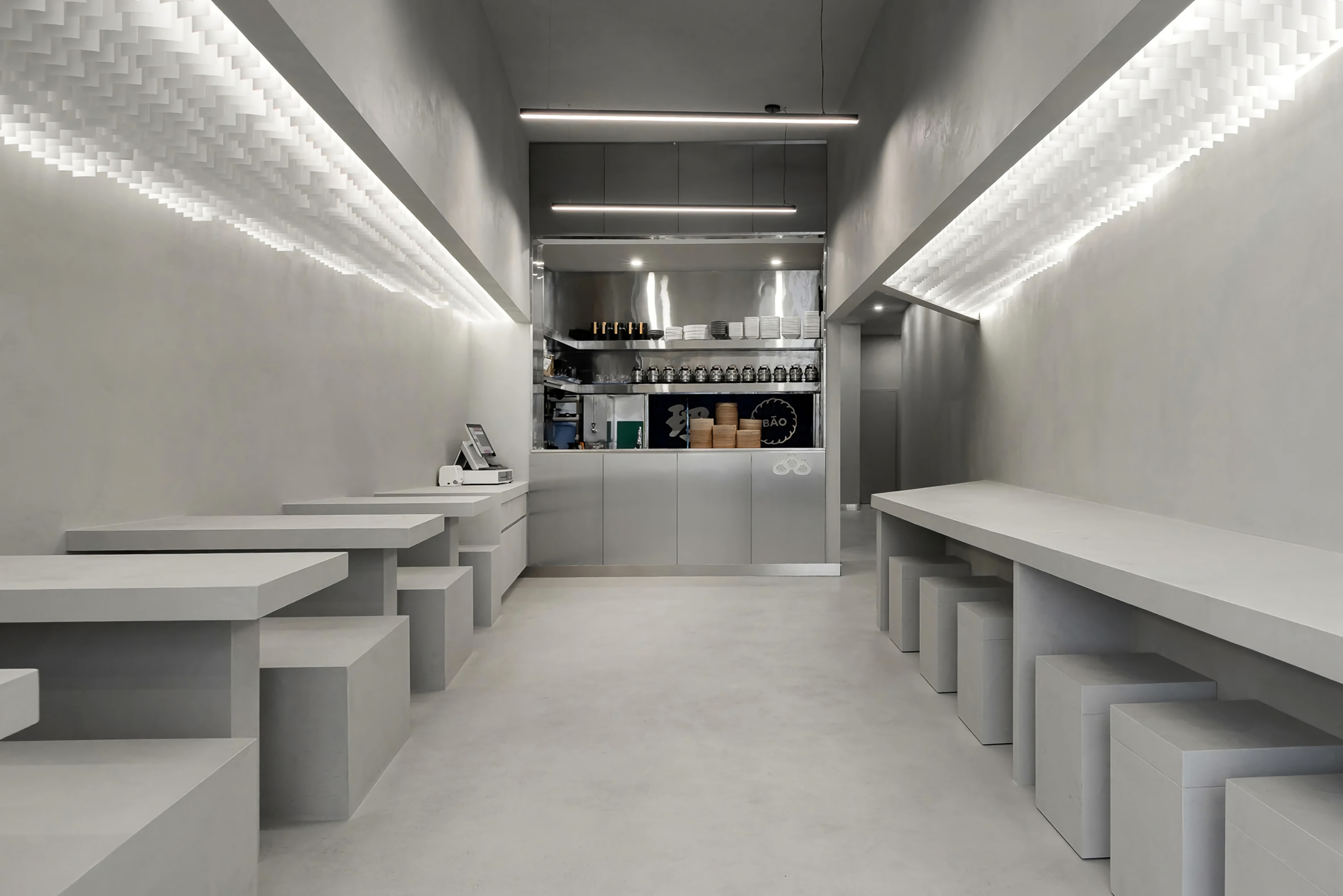 (The play of fine lines as a dramatic form of minimalist visuals)
To realize the minimalist concept, Studio AC then played fine lines as a form of dramatic minimalist visuals in the interior of Bao Express. This can be seen from the layout of the table on the right and left of the space as if pulling the perspective line toward the kitchen behind it. The play of lines is also visible on the lights designed to follow the transverse lines in the circulation of space.
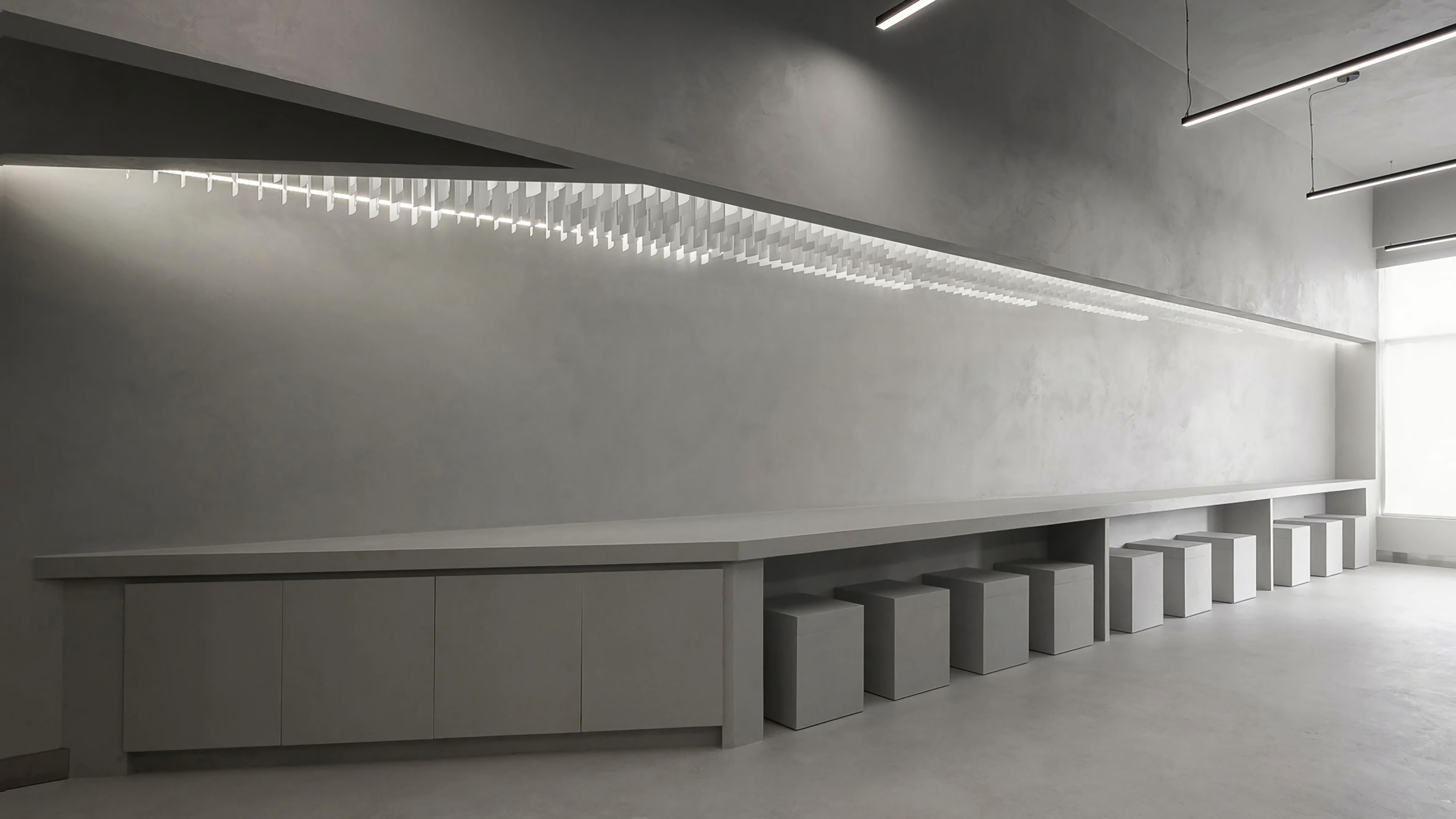 (Monochrome colors dominate the interior of Bao Express)
Deeper into the hospitality area, the open kitchen concept makes it easier for customers to take their orders home while creating an efficient use of space. Not only thinking about convenience for takeaway customers, but Ac Studio also provides comfort and convenience for customers who want to eat on the spot, namely by providing minimalist tables and chairs placed on the right and left sides of the room.
The experience offered is even more diverse when visitors enjoy the presence of large windows directly opposite the street outside, equipped with a simple façade that is expected to blend in with the surrounding environment.
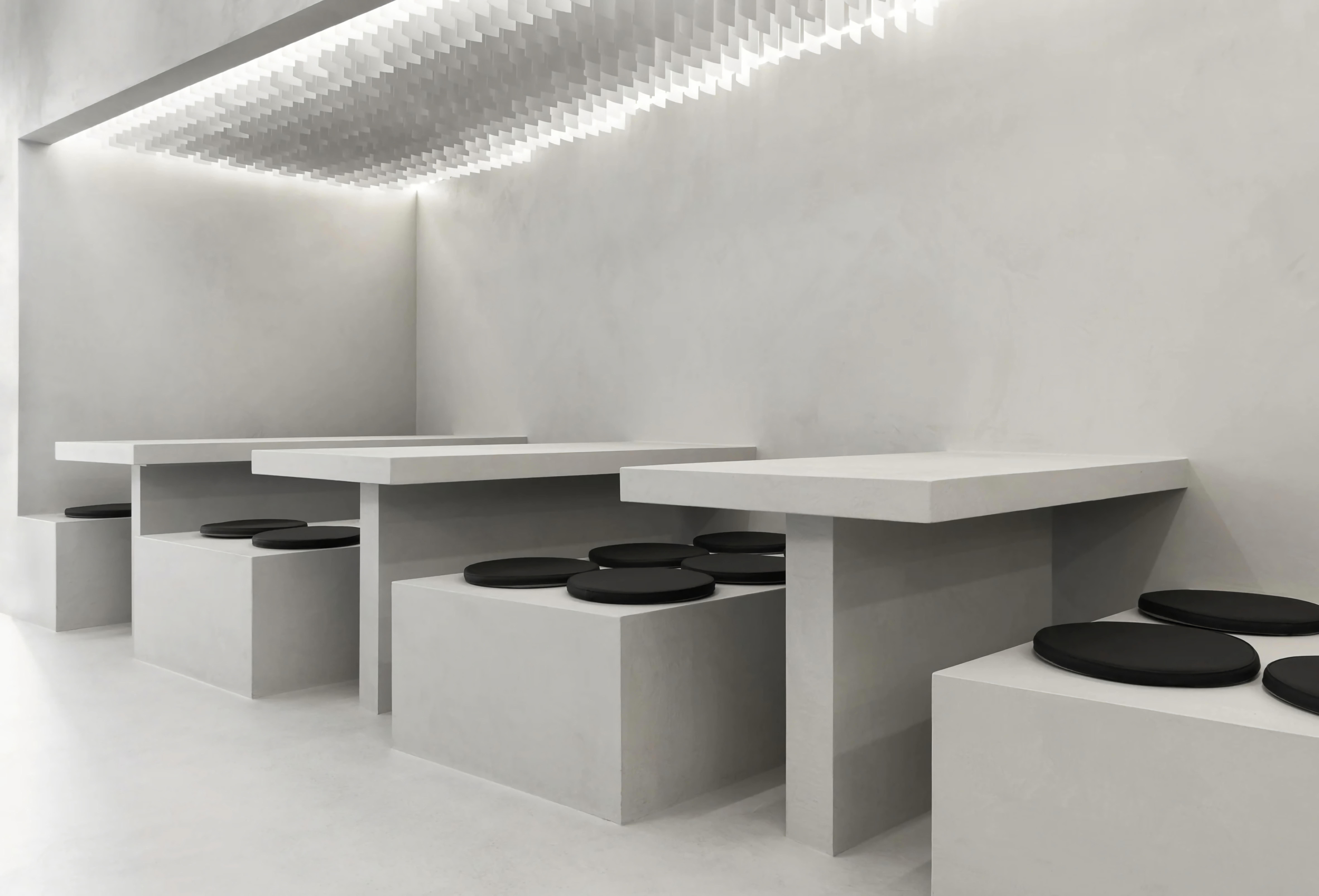 (Traditional Chinese seating mat completes the comfort of Bao Express)
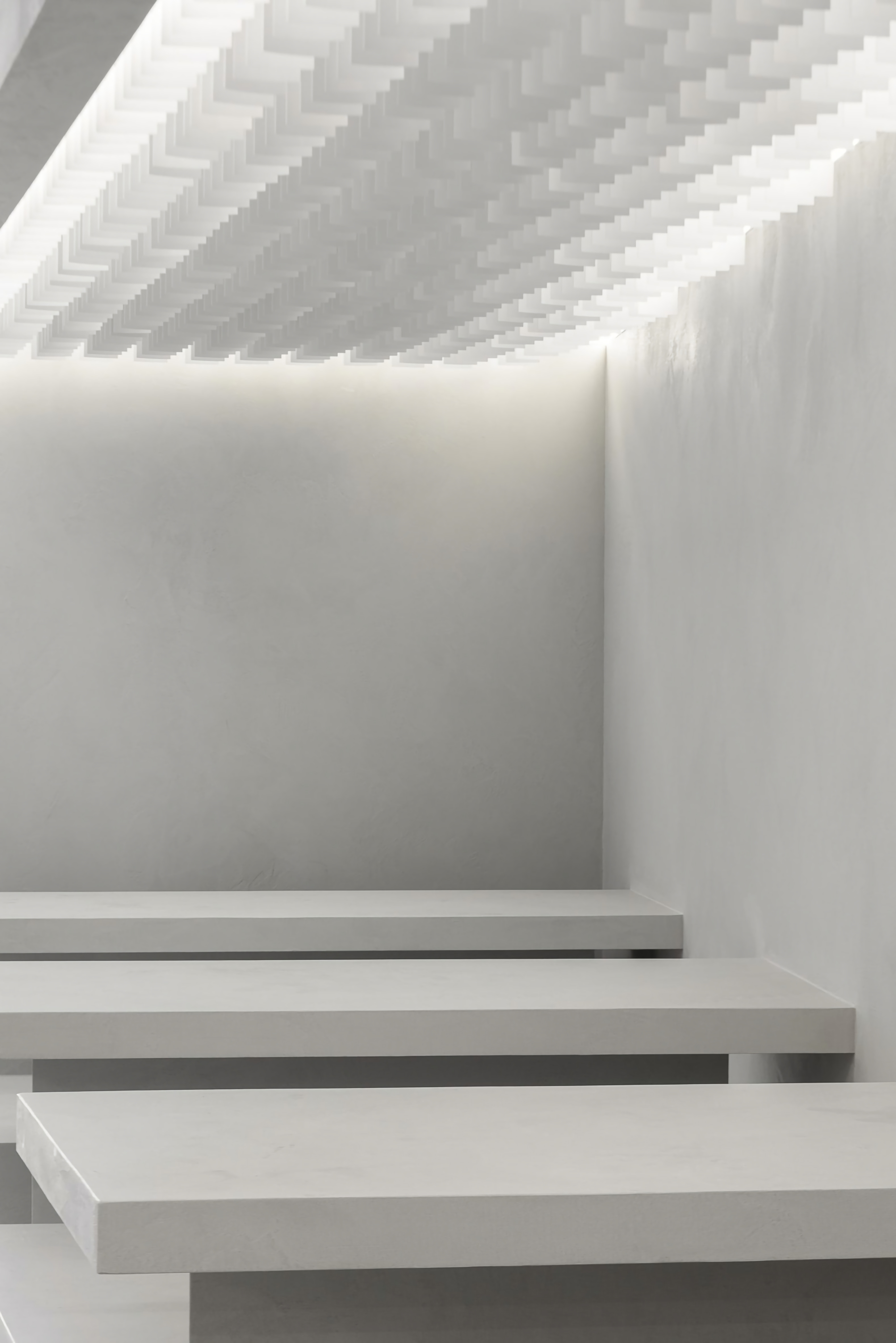 (Pleasant lighting is made of backlit that is usually found to create billboards)
Something is interesting in the design of Bao Express, that is, the AC Studio only uses four materials for its interior construction such as; cement used to make chairs and tables built minimalist gray, and stainless steel applied to the kitchen counter, due to its strong and reflective properties to give a luxurious impression to the room. Furthermore, pleasant lighting is made of backlit to add perfection and intimacy to the dining area, and finally polyester, this material is used as a seating base commonly found in traditional Chinese interior styles.
"We consider all the furniture to be part of the architecture," explains the designers, who created a dedicated desk and seating for the project.
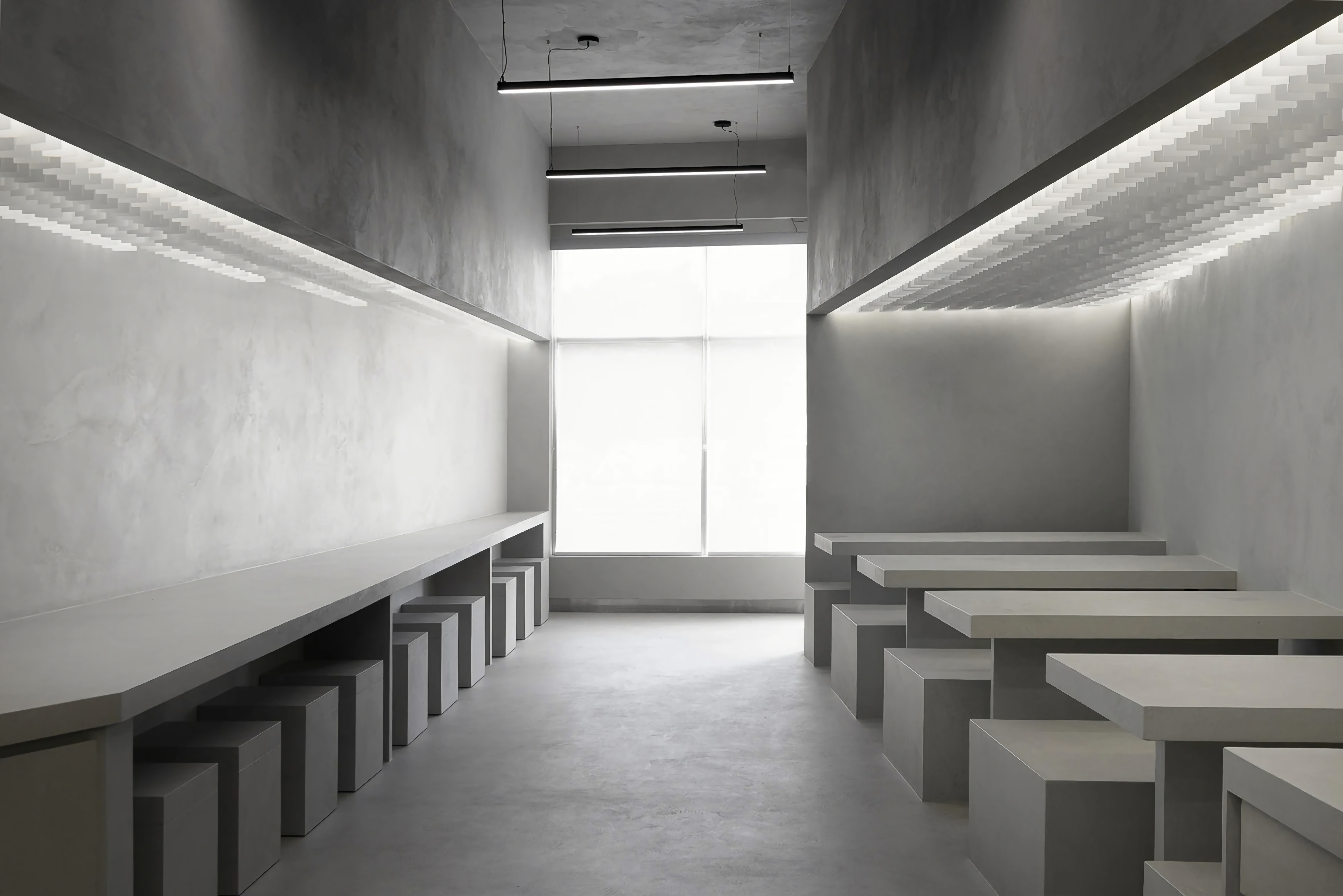 (Minimalist tables and chairs made of cement)






Authentication required
You must log in to post a comment.
Log in