Zeppelin House Looks Like A Floating Orange Ship in A Fairytale
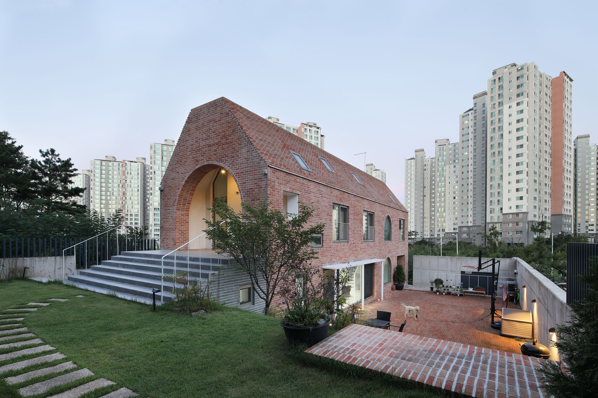
The appearance of this building is like a floating orange brick ship. Propped up by a single pillar with a sharp shape which adds to the impression of floating in the vast waters. Then shows the impression of a building like in a fairy tale or children's storybook. That's why “Zeppelin” became the name for this project.
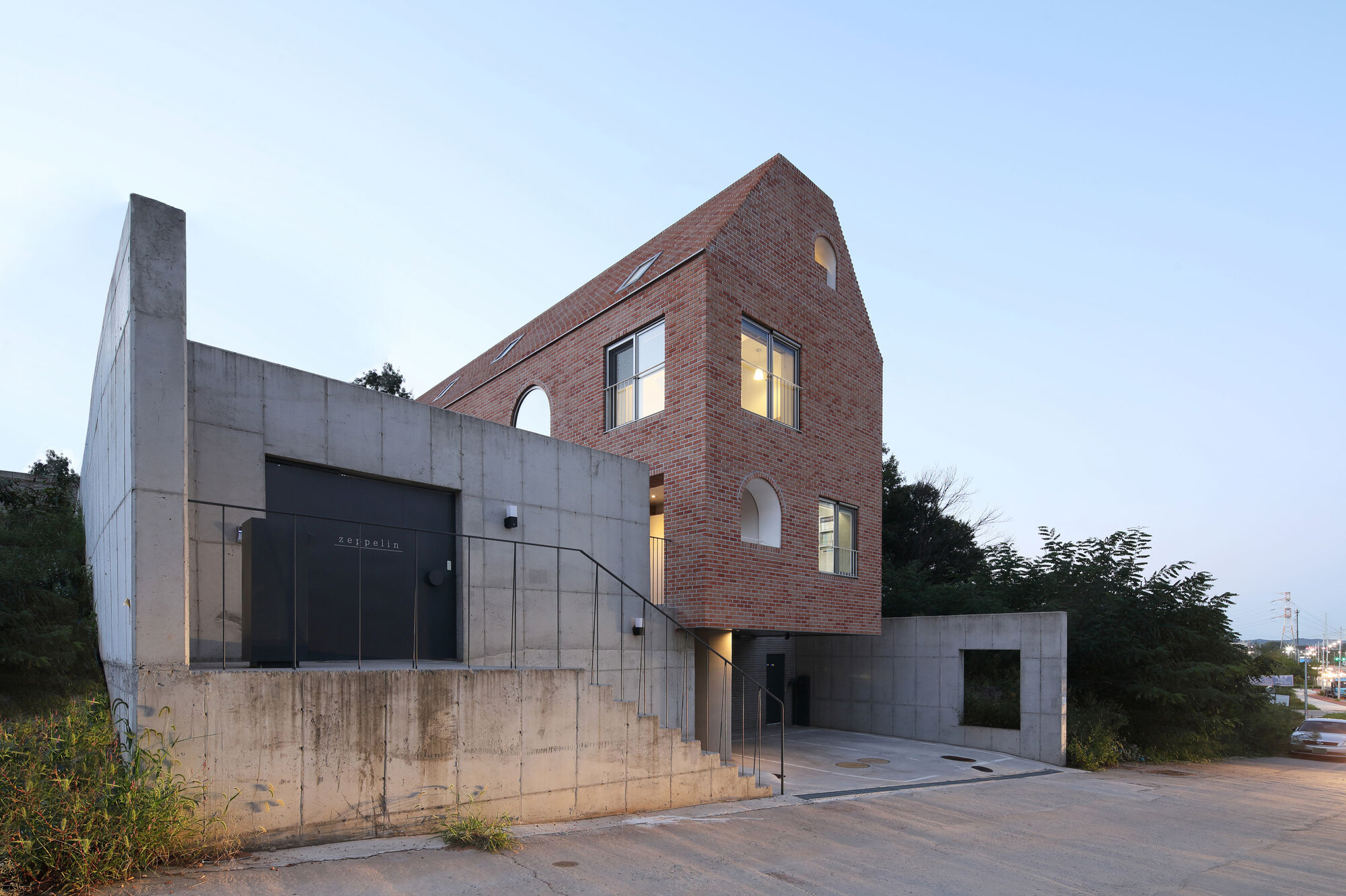
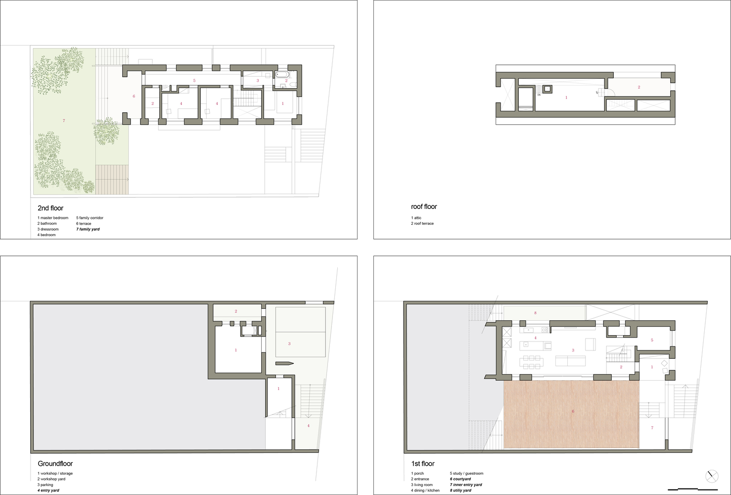
A family residence occupies a sloping site in the border area of Gimpo City, South Korea. SOBO Architects designed Zeppelin House on three floors, the ground floor is the entry floor that is used as a warehouse and workspace. One level above accommodates the living room and kitchen, while the second floor is used for the main bedroom and children's room. The top floor is an attic that will connect to the roof garden placed above it.
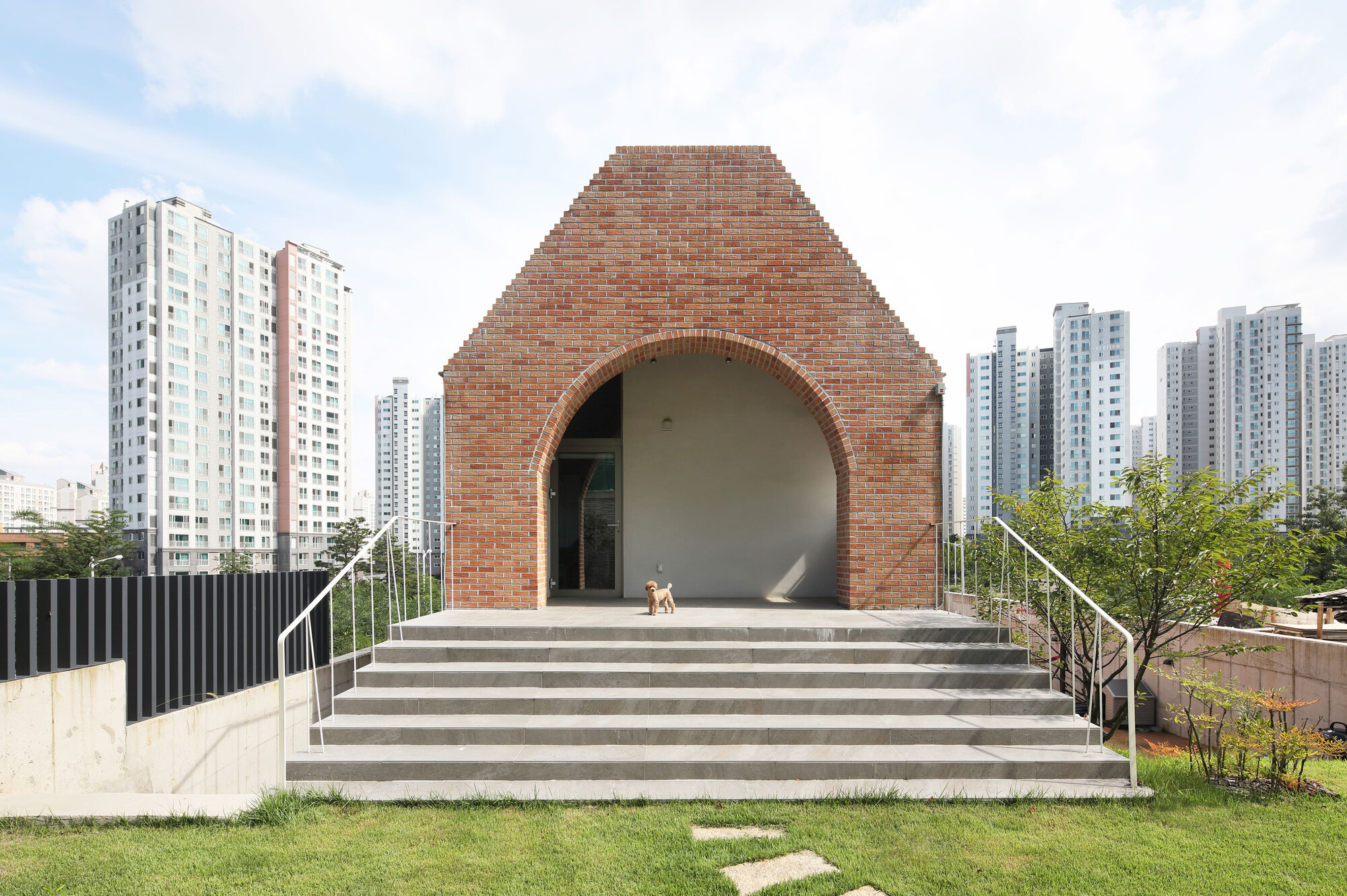
Occupying an area of 446m2, Zeppelin House is divided into two main areas, outdoor and indoor. Interestingly, with the limited land, the team provided an outdoor area with a wider calculation than the indoor area. SOBO Architects deliberately designed these two areas with different size scales, enclosures, and hierarchies. As a result, six open spaces were created, from the lowest entrance to the deepest and topmost rooftop garden.

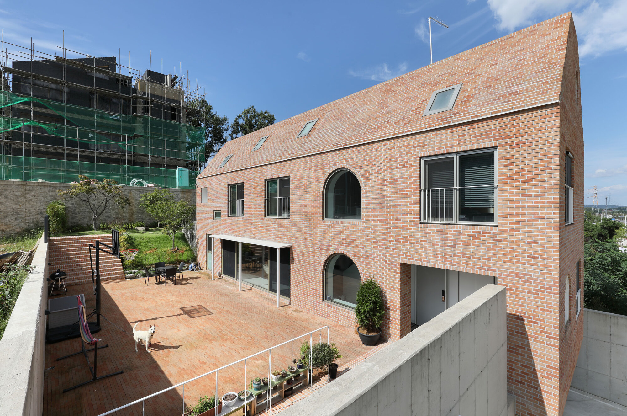
Zoning rooms according to the hierarchy begins when the occupants enter, external space changes its character from public to more private and is intended only for families. In addition, three of the four sides of each space are placed facing the various elements such as railings, stairs, or slopes. While the other side faces the building is in contact with the inner room.
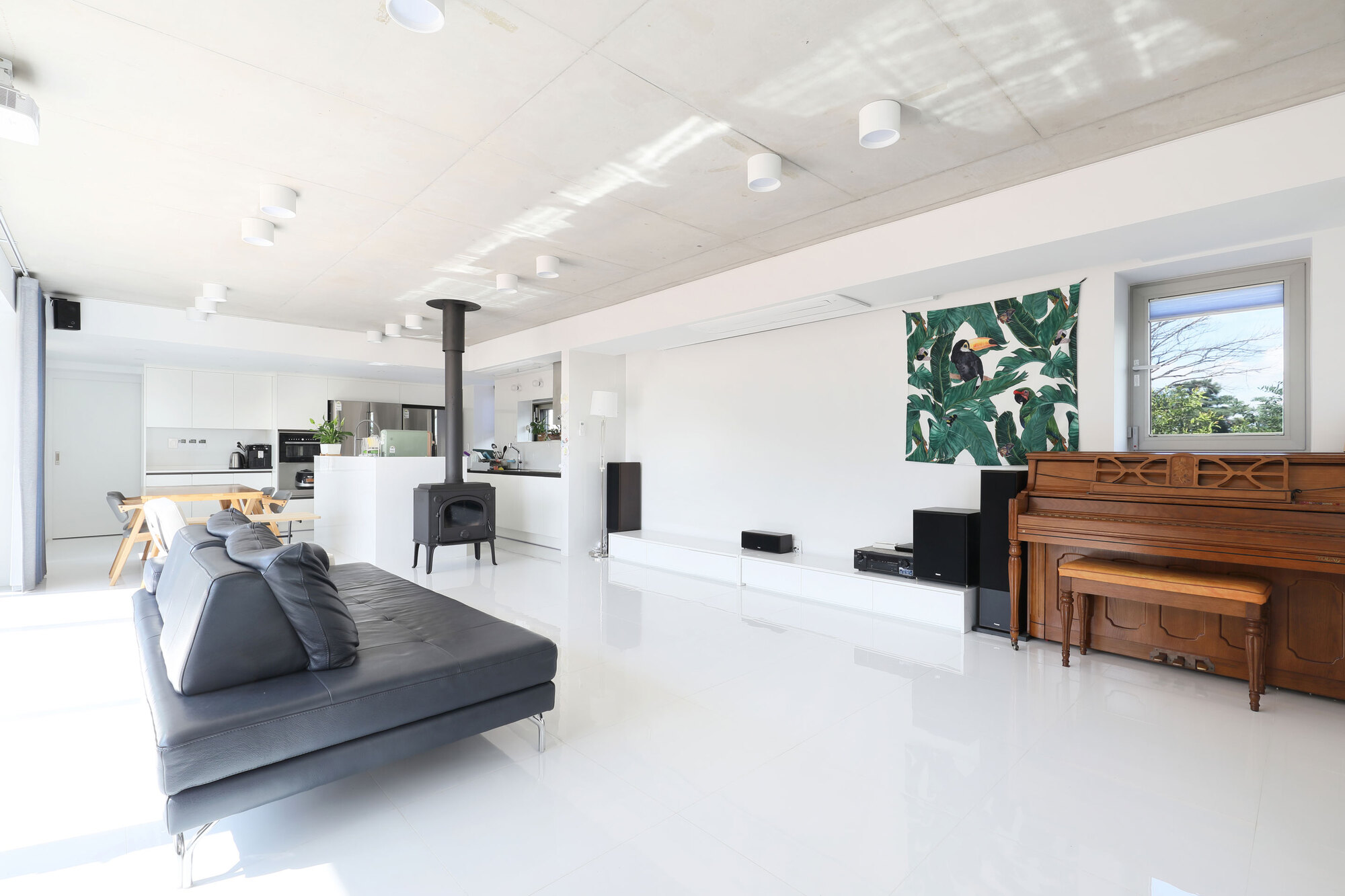
This creates the character and hierarchy of each external space to be different from the adjacent internal space. For example, a room facing the family room has a higher hierarchy and privacy than other rooms adjacent to the living room. Then, rooms are connected to the kitchen as circulation space and utility services.
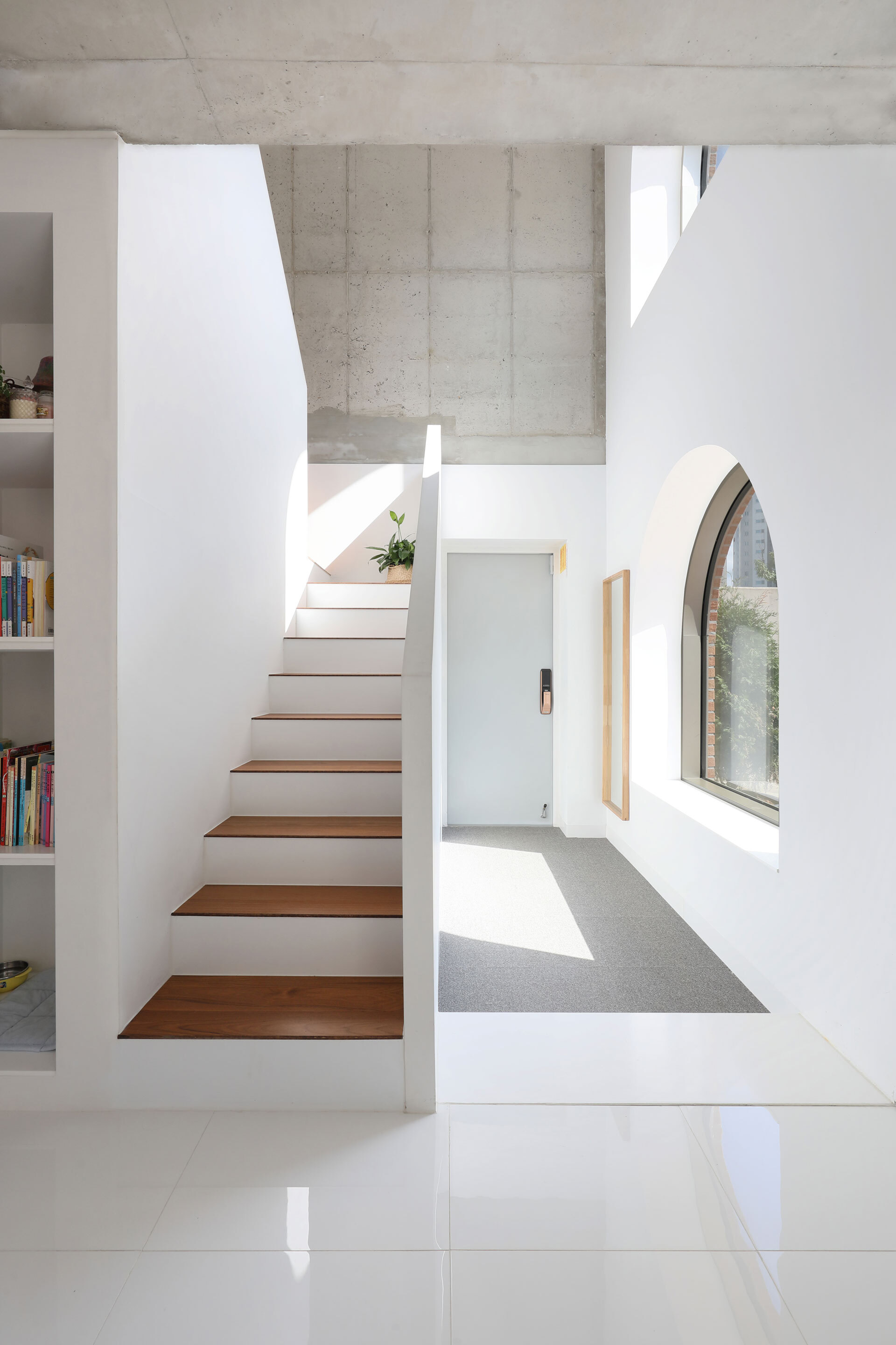
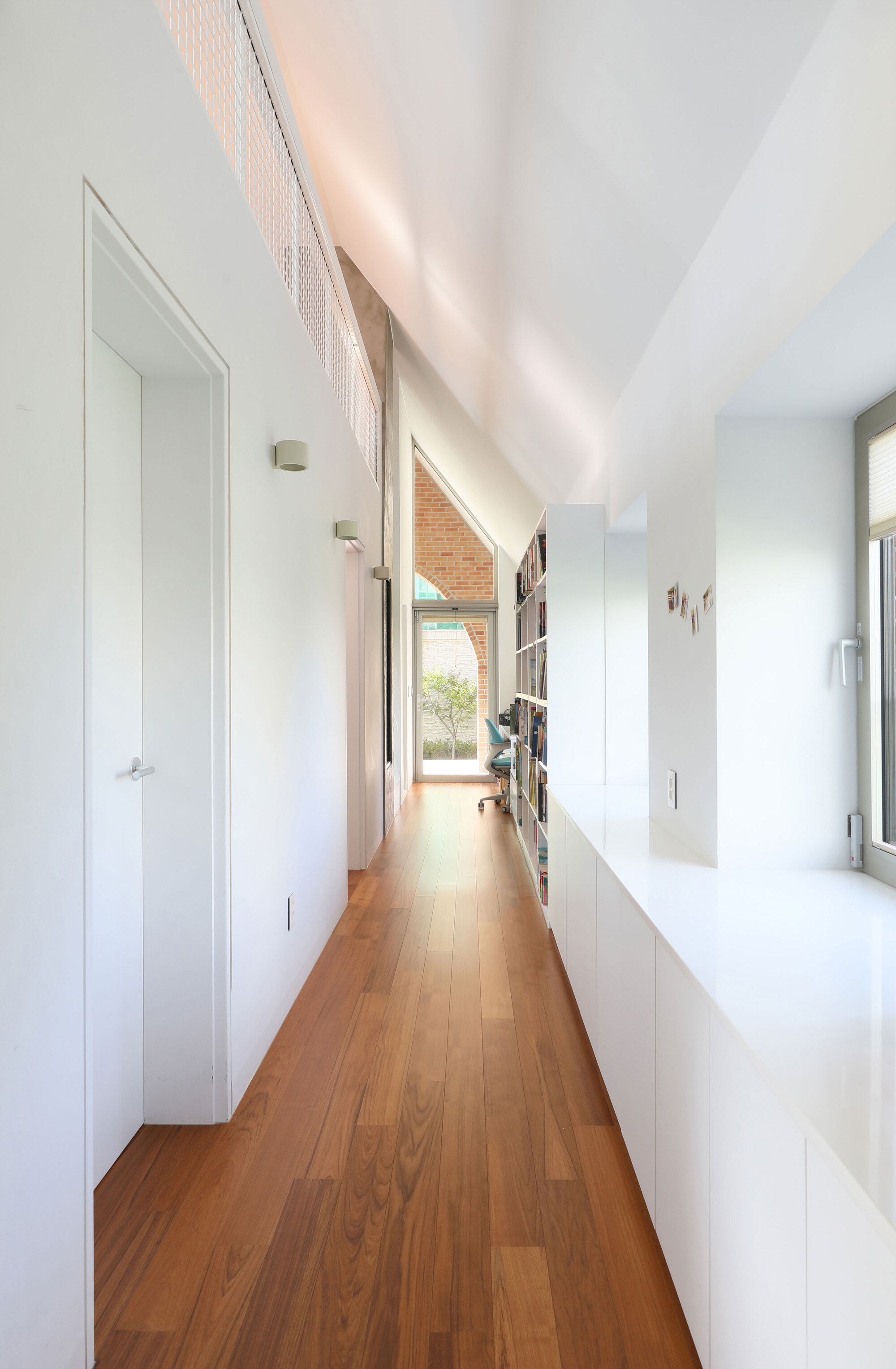
Zeppelin House as a whole displays a calm and warm visual. To create such a visual, simple but heavy materials are used. So for the ground floor, the surface uses exposed concrete and cement bricks to make the podium. The surface of the building, from the bottom to the roof uses bricks of uniform color and size. The entrance section with an expressionless dry character, the upper masses, and the living room are meant to display brightness and seriousness at the same time.



Authentication required
You must log in to post a comment.
Log in