Bold yet Simple Vaulted Living Space Extension at Bewboc House
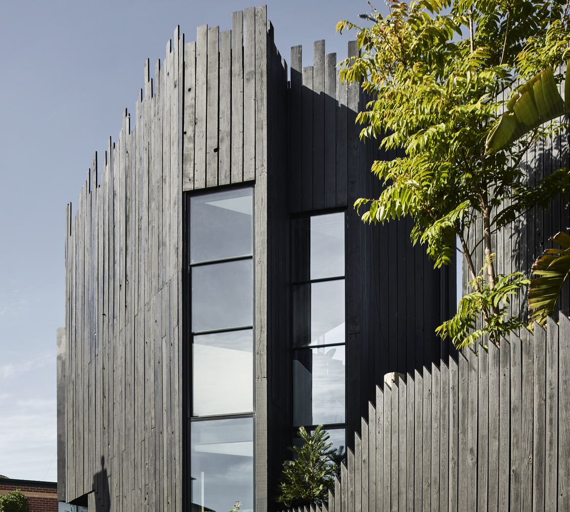
Bewboc House looks slightly different from the surrounding tropical suburban houses in a residential area in Kuala Lumpur. The client was a young family, and this is one of Fabian Tan Architect's projects among many other innovative residential designs.
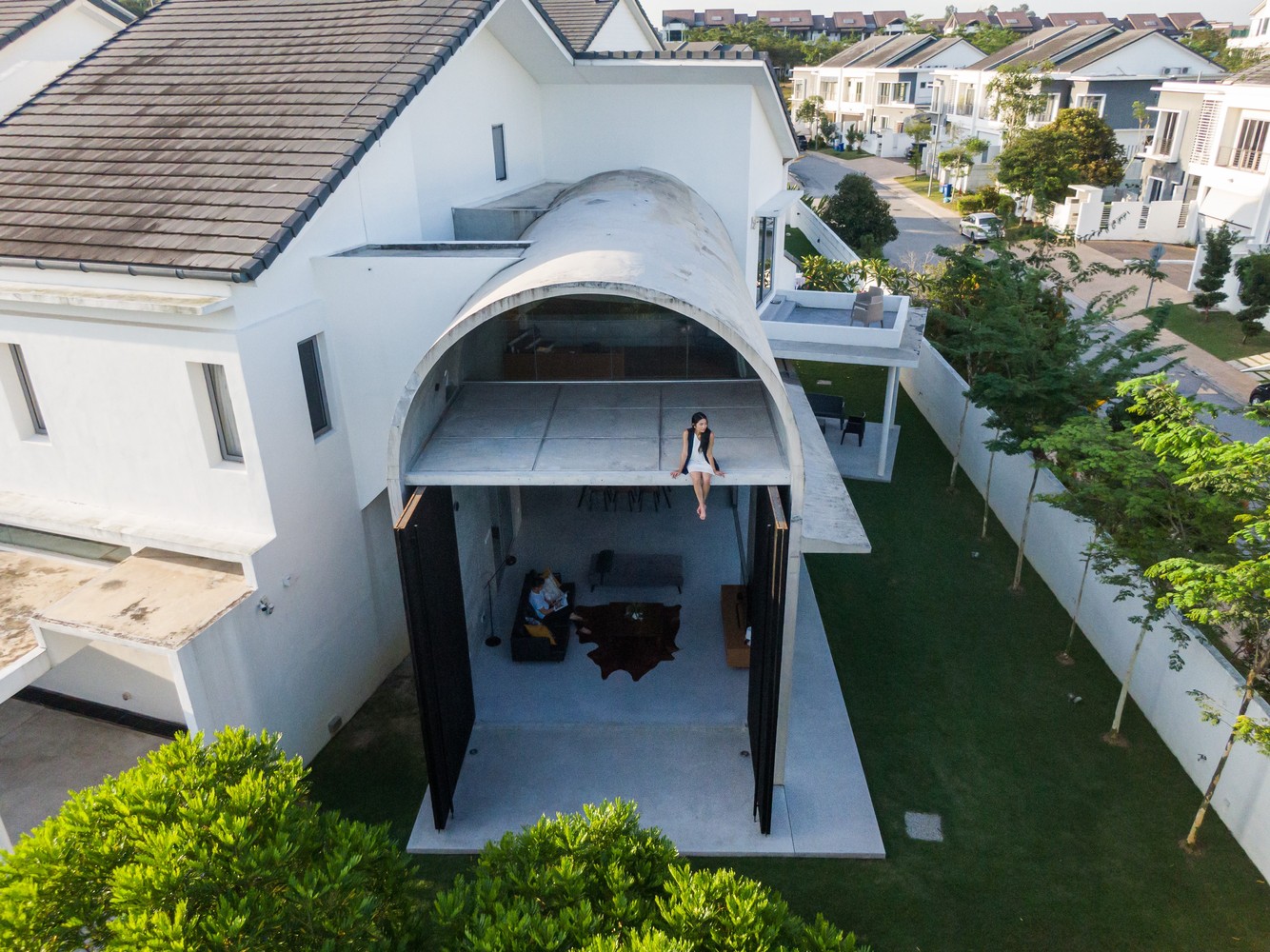 Bewboc House appears a bit different from its surroundings (cr: Ceavs Chua)
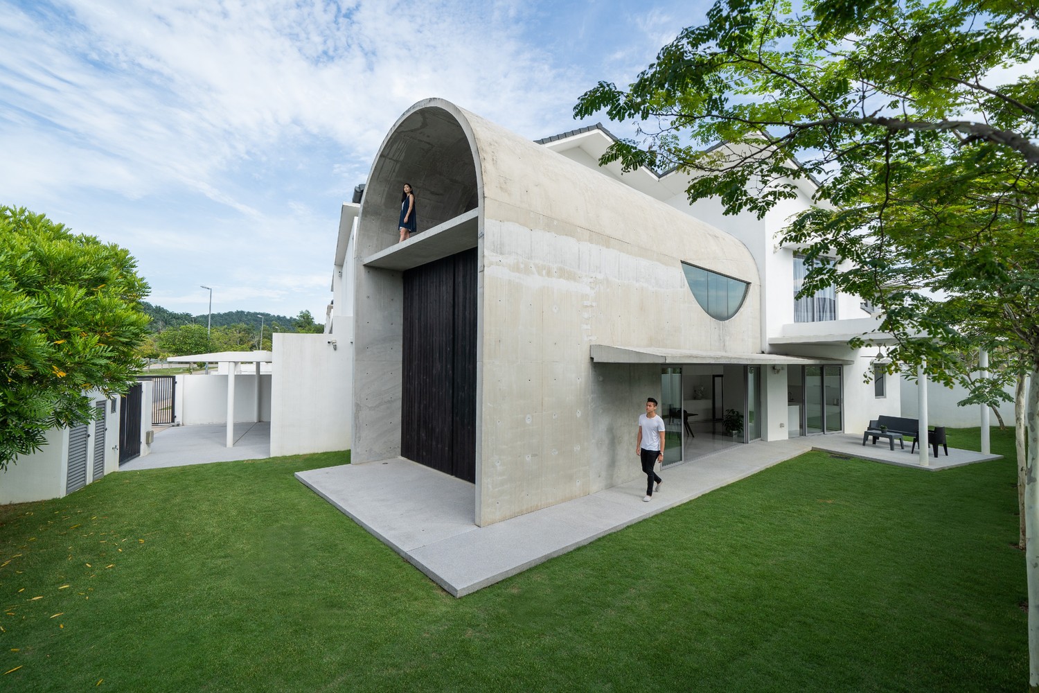 Bold yet simple design (cr: Ceavs Chua)
The design mainly aimed to rearrange the living space according to the available land in a bold yet simple manner. The site, located in a corner, has an additional area on one side, which the architect then utilized to expand the main building with a living space. As seen by the floor plan, the expansion was oriented to the shape of the land perimeter so that the building is not parallel to the existing house.
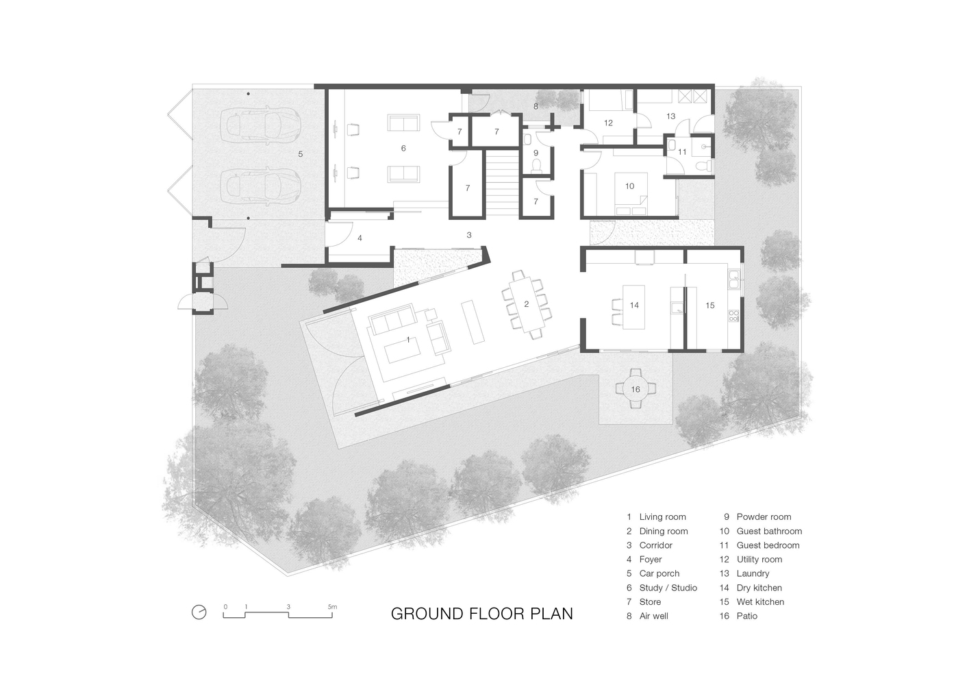 Floor plan
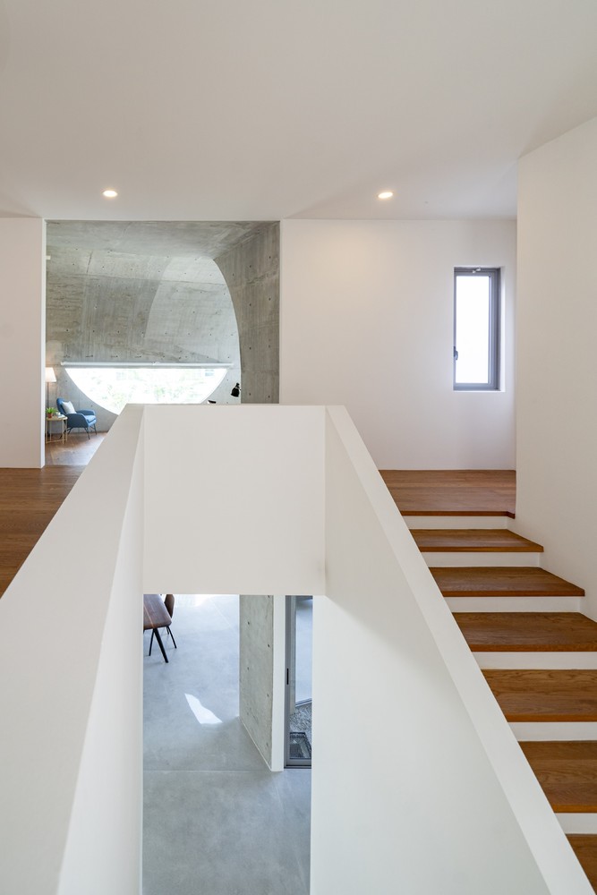 The connection between the two masses (cr: Ceavs Chua)
The angular difference between the two masses leaves a triangular gap. The gap, coupled with the expanse of grass next to the garage pavement, further emphasizes the contrast between the two characters next to each other. In addition, the gap also becomes a lighting well and a fresh air supplier for the spaces on its right and left sides.
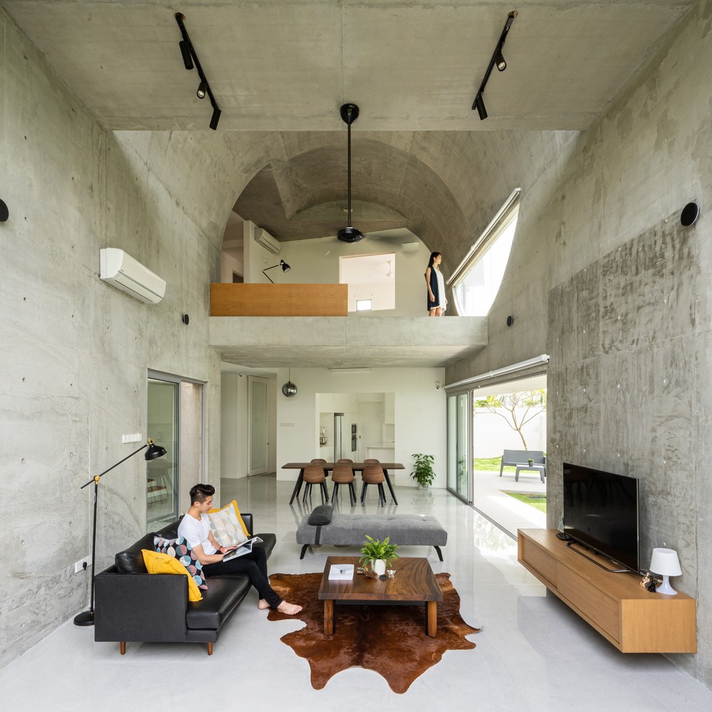 Double-height living room (cr: Ceavs Chua)
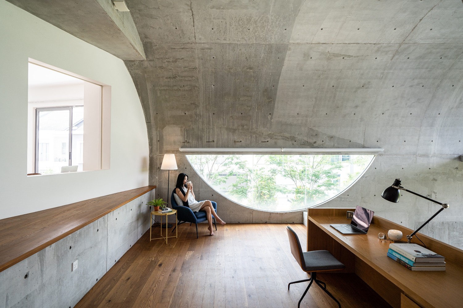 The working space (cr: Ceavs Chua)
In the extension building, space is formed under the shade of vaulted planes that spread continuously from one to the opposite side of the floor plane, becoming walls and roofs. The curved peak height provides the living room with a double-height ceiling. The spacious room was divided into two levels by horizontal concrete planes at the front and back: a working space on the inner side, and a balcony at the front.
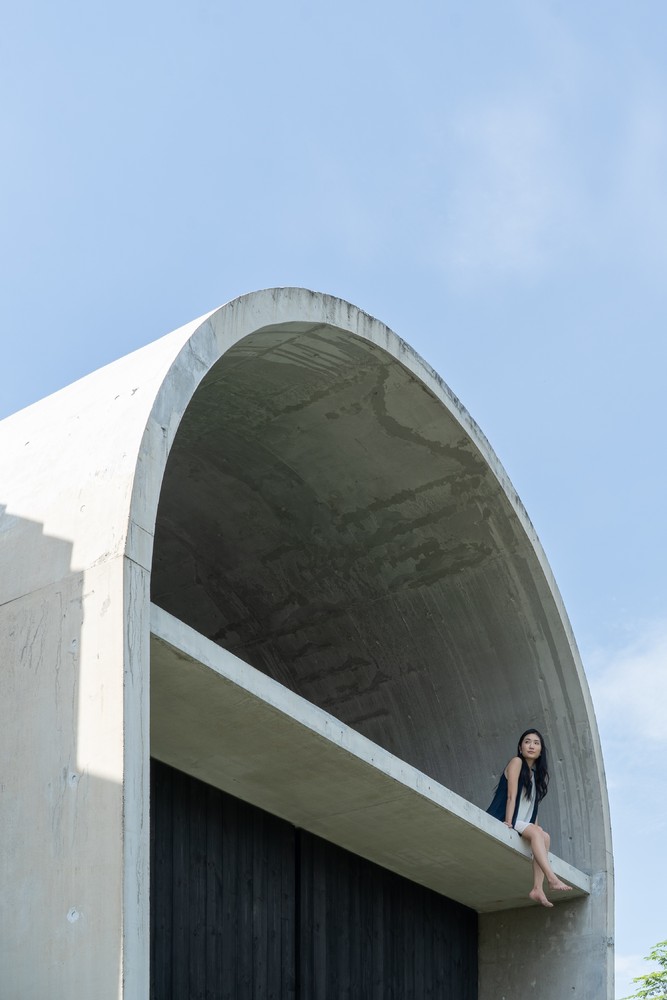 The balcony (cr: Ceavs Chua)
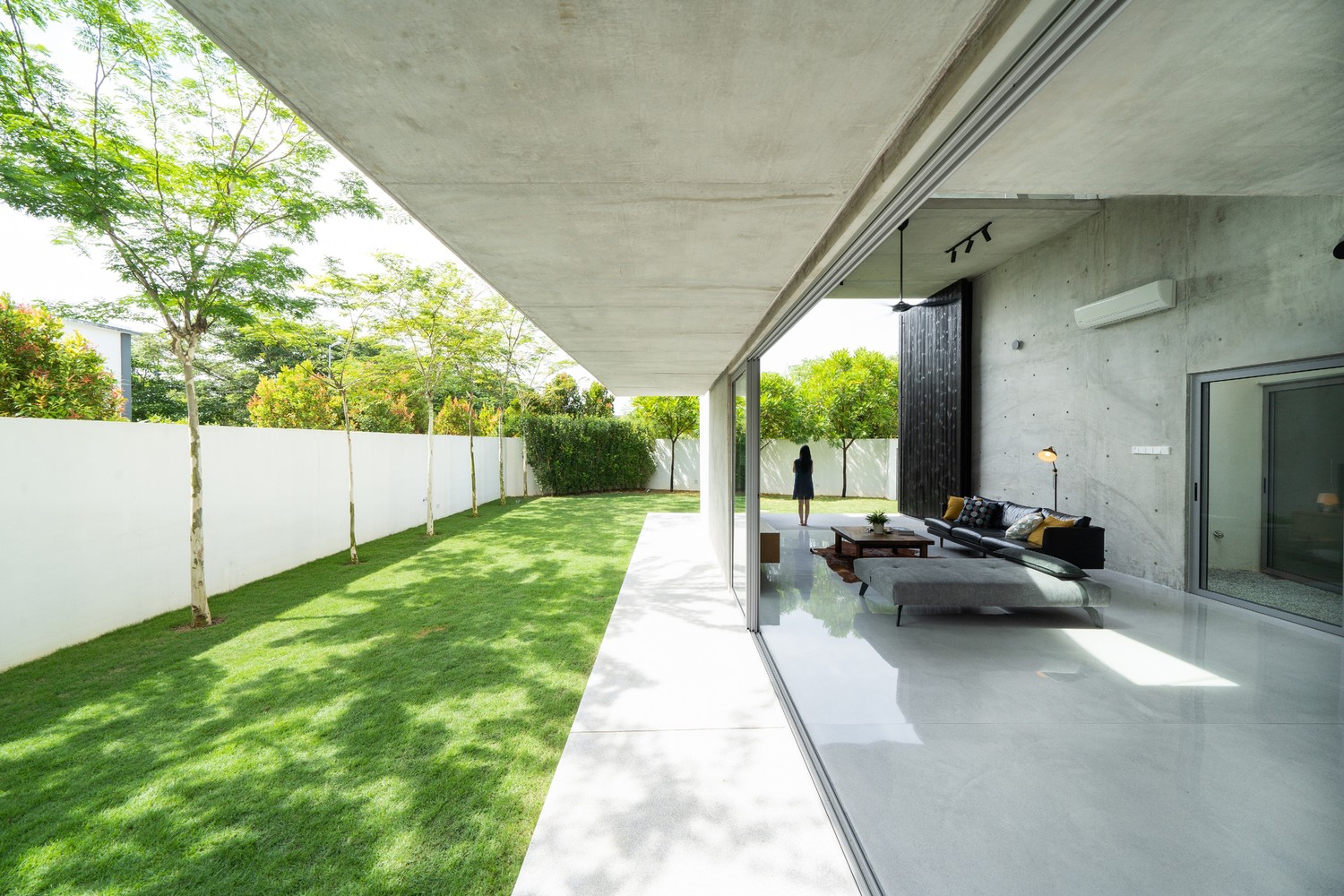 Wide open ground floor (cr: Ceavs Chua)
On the ground level, where the living room and kitchen are located, the doors open extra wide—the front door was designed on a “giant” scale. Meanwhile, on the upper floor, a half-round window is carved into the workroom's wall. The extensive openings on various sides blur the boundaries between outside and inside, between home and nature. Not only that, the interior has a high degree of openness so that each room is connected visually, one room is visible from another room.
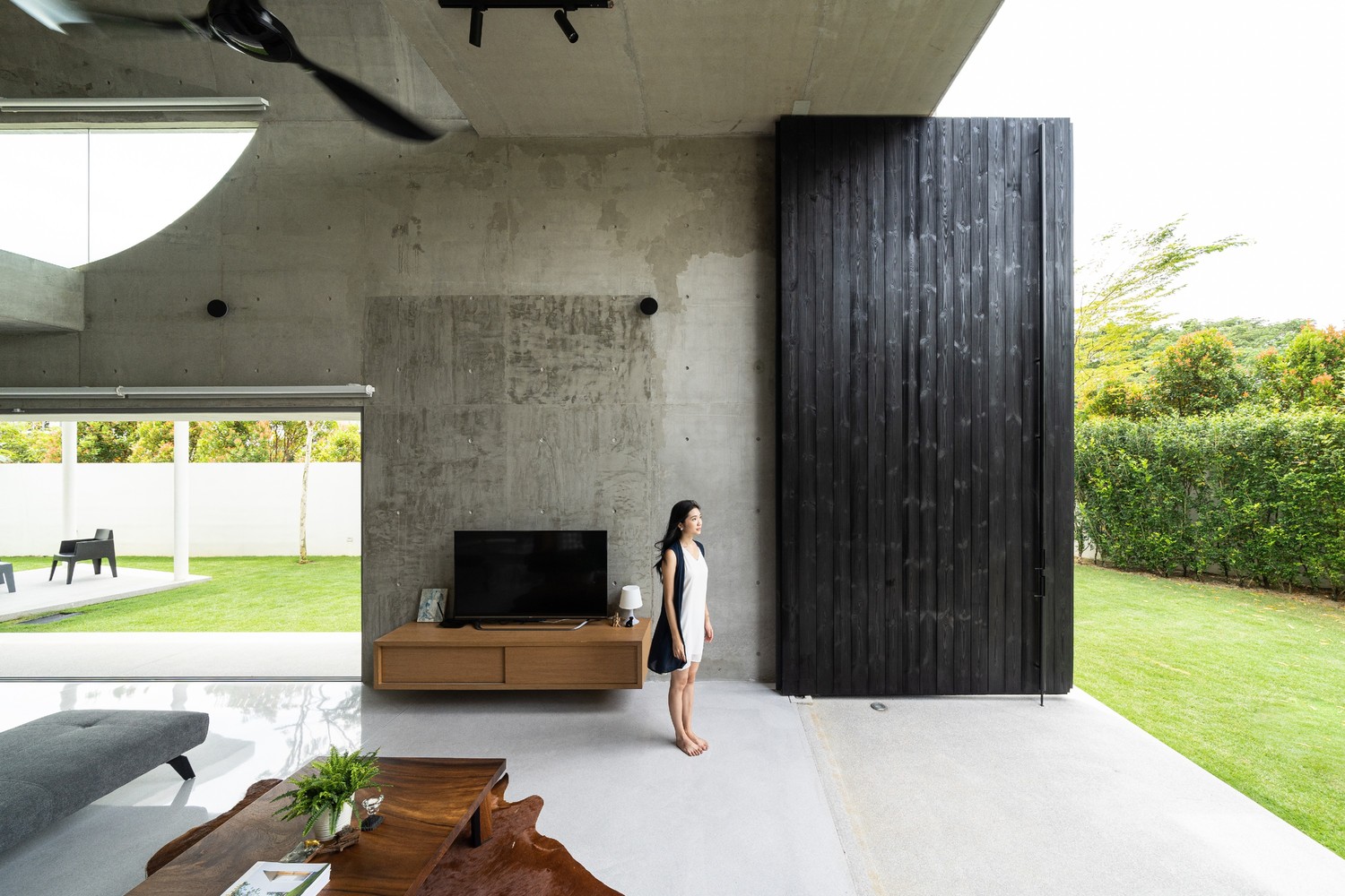 “Giant” scale front door (cr: Ceavs Chua)
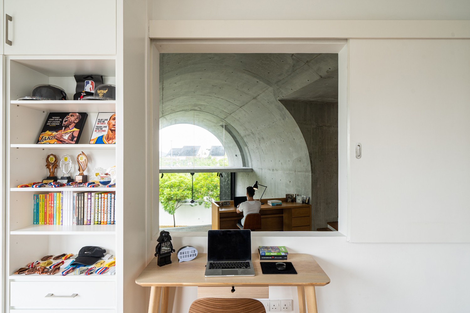 Visual connectivity between each room (cr: Ceavs Chua)
At the request of the young family, this house was designed minimalist without much excessive intervention. All concrete elements were left raw, showing their sturdy character next to the whitewashed building. The interior combines neutral nuanced elements such as monochrome black and white and timeless wooden accents.





Authentication required
You must log in to post a comment.
Log in