The Power of Open Spaces: 5 Design Concepts for Enhanced Living
An architect or designer must present open space in a building design. Awareness of open space for one's physical and mental health, especially after the Covid 19 pandemic some time ago, is the driving force behind the importance of presenting open space in every building, in this case architects and designers must be able to maximize the existing potential and think about the possibility of presenting open space even though it is only a small space. Here are 5 examples of open space concepts in building design
The Sala Garden, LUKSTUDIO
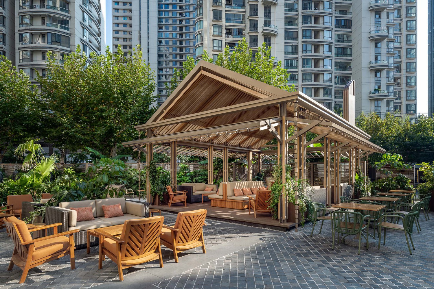 The Sala Garden, Photo by Dirk Weiblen
Occupying a less productive area makes it challenging for Lukstudio to turn it into an open space for guests before entering Sukhothai Hotel. In 2017, Sukhothai opened its first location in China in the heart of Shanghai with the concept of an "urban oasis", bringing modern urban society traditional Southeast Asian hospitality with a contemporary twist.
Lukstudio renovated the outdoor area connected to the bar and restaurant inspired by the traditional Sala, an open-air pavilion throughout Thailand for resting or gathering. With a pointed-roofed pergola structure on a raised wooden platform designed with grilles swung on all four sides. The welcoming form creates additional shadows and gives a tropical feel to social destinations. Taking inspiration from the hotel's Southeast Asian roots and addressing the specificity of urban sites, Lukstudio has transformed underutilized spaces by blending natural expressions.
FORT7 House, Takeshi Ishiodori Architecture
 FORT7 House, Photo by Studio Marsh
Takeshi Ishiodori Architecture was challenged by its clients to realize their clients' wishes to live with plants in the middle of a densely populated area near downtown Miyazaki City. This poses a unique challenge because the client wanted a living space filled with green in a manageable and dense space; the architect overcame this challenge by designing a house with three courtyards.
The house is designed to embrace nature, starting in the northernmost bedroom where it will get sunlight penetrating the trees in the secondary garden. The glass-enclosed outdoor living area adjacent to the main garden offers the perfect space to enjoy the outdoors and relax. The main garden on the south side of the living room resembles a shrub, while the yard between the living room and the bedroom serves as a secondary garden. The third is a court with an open-air bath. Each page is different in design and has its own role.
Olivia Business Center office, Malinowski Design, Urban &; Landscape
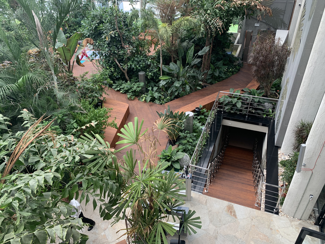 Olivia Garden, Photo by Bartłomiej Chęcinski & Dariusz Malinowski
A workspace with the concept of "Nature Connect" in the heart of the Olivia Business Center office complex in the Tri-City business district of modern Poland, it was designed by Malinowski Design Urban &; Landscape. The project seeks to bring tropical ecosystems to the pavilion's interior by blending nature, people, and technology. This park is expected to be a place to unwind after dense office activities and through contact with nature which is difficult to do, especially in an urban area.
The design created by Malinowski Design pays attention to the most important details of building utilities, such as noise levels, air quality, and the type of light, as well as the environment that is very well maintained so that it can have a calming effect on the environment. With a land area of 800 square meters, Olivia Garden is planted with about 4,000 plants represented by 118 species and varieties from various countries, namely Indonesia, Australia, New Guinea, Madagascar, Venezuela, and the Amazon tropical forest. The park is divided into three zones for dry, wet, and floodplain vegetation to coordinate the thousands of greenery to make it more attractive. The differences between the three zones are characterized by different plants and substrate types tailored to the needs of each type.
Raga Svara Wellness Center, Shanmugam Associates
 Raga Svara Wellness Center, Photo by Vinay Panjwani
This Wellness Center invites visitors to pause, reflect, and listen to the body in synergy with nature. Therefore, Shanmugam Associates architects designed this place by connecting the building and the surrounding environment, by exploring the design through a biophilic approach the architect placed a circular garden in the lobby as an entrance while welcoming guests with a wide view with an open roof. The architect also added gardens to provide natural air to the building as it is planted with many plants and invites visitors to walk to see the whole area.
The interior design of this building is specifically designed to give the impression of comfort and prosperity to its visitors. As in the yoga room, the floor is connected between the inside and outside by a landscape, surrounded by several glass walls with maximum transparency to enjoy the lush vegetation and the roof made of unpolished concrete slabs. The room's interior design blends with the garden outside because it uses a natural color palette, and the material is mostly wood. As branding and identity, asymmetrical mandala patterns are applied to lookbooks, signage, exposed concrete ceiling patterns, wall murals, and floors. Furthermore, Shanmugam Associates built winding paths amid a lush landscape of wellness centers to connect its spaces. In addition, many corners, such as a grandstand-shaped garden, are quiet to ponder. Thus, Raga Svara Wellness Center is a place of self-relaxation that offers tranquility and communication with nature in India.
TRIVIUM, ALIVEUS architecture
 TRIVIUM, Photo by Fotoglab
TRIVIUM is a manifestation of the client's long-standing desire for a place to relax from busy activities and also fill the mind when visiting with pure void space as nature provides mountains, water, and sky. This is the key for ALIVEUS architecture in filling buildings with structures and emptying them to incorporate nature and determining what to expect from TRIVIUM in the future, such as the nature of light. The word "TRIVIUM" aims to convey the aesthetics of emptiness to visitors through three natural elements.
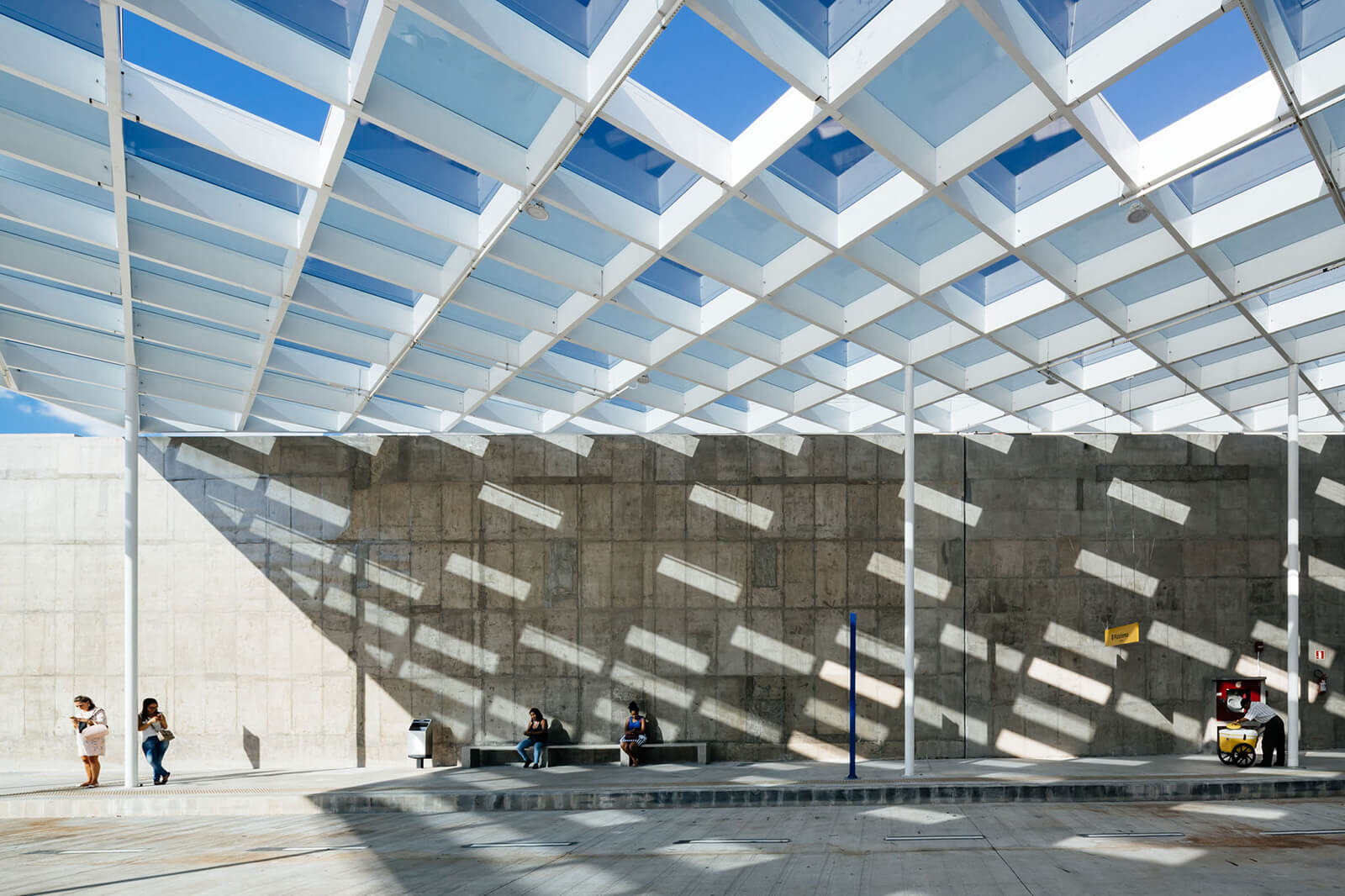
Involving the collaboration between the client and ALIVEUS architecture in the design process of this building to tailor the design that truly matches the client's expectations by focusing on simplicity creates a design that brings nature into every space. Structural simplicity should be the main context for the overall design. As in the central communal space on the second floor, the architect created a waffle structure with a square open to the sky, allowing horizontal and vertical openness and providing opportunities to experience various sky views. Under the skylight, there is a shallow pool to strengthen the character of the building that must always be connected to nature. Besides that, there is also an outdoor area with a larger shallow pool.




Authentication required
You must log in to post a comment.
Log in