TAG Espresso’s Adaptable Pop-up Store Comprises Two Module Types
Coffee has become a worldwide trend reaching various groups of people. Events such as festivals, exhibitions, and concerts are also at their peak in recent years. These two forces have encouraged TAG Espresso to custom a pop-up store that could accommodate the demand to open temporary kiosks in different places.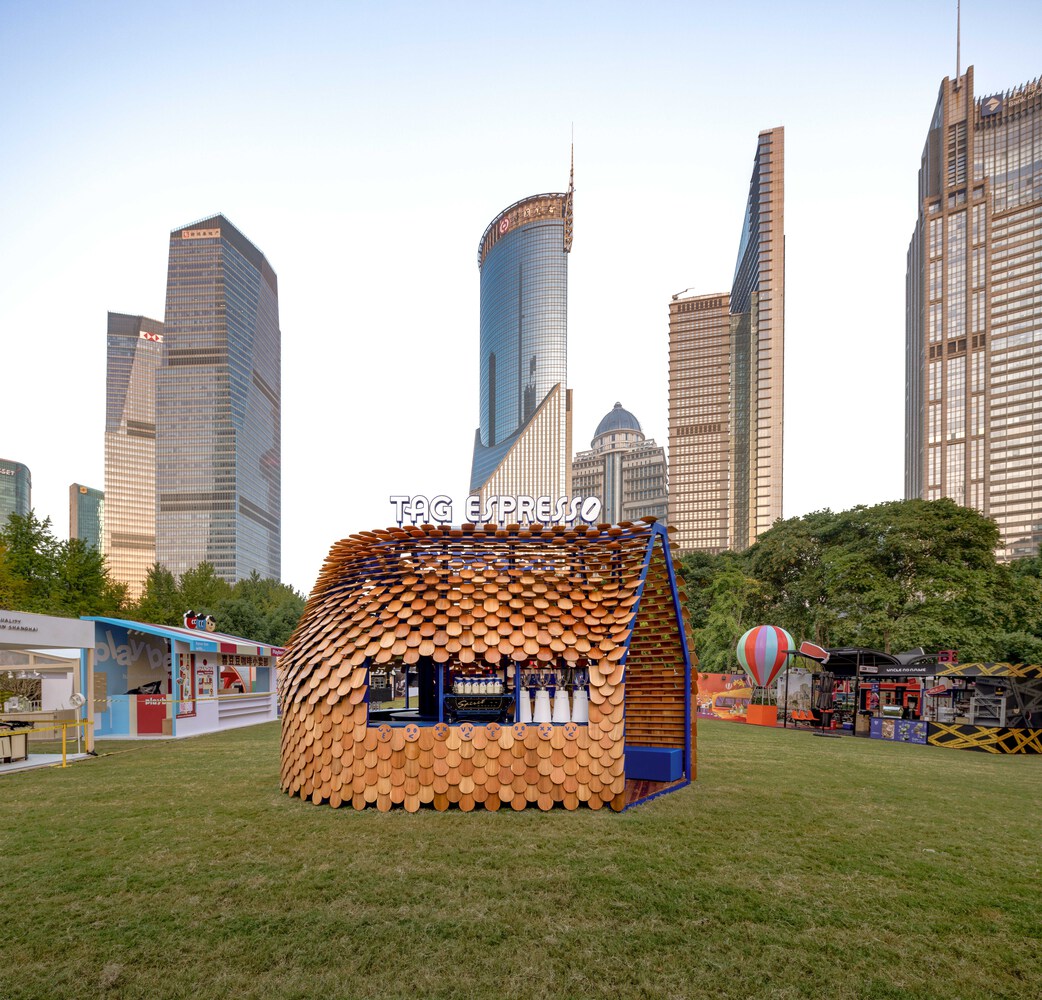 TAG Espresso’s pop-up kiosk in a festival (cr: half.half.photography)
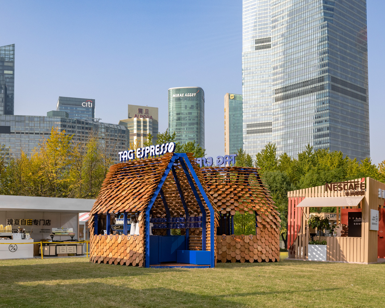 Modular installation by atelier TUO and studio yo-u (cr: half.half.photography)
Atelier TUO and studio yo-u worked together to make the wishes come true by designing a store with a modular system. Considering the temporariness, modular design that is easy to assemble and disassemble is the right choice. Not only that, but the building efficiency should also be taken into account; the structure must reduce waste from cyclic use and accommodate demands for all types of site conditions that could vary inconsistently, starting from squares to parks, to malls.
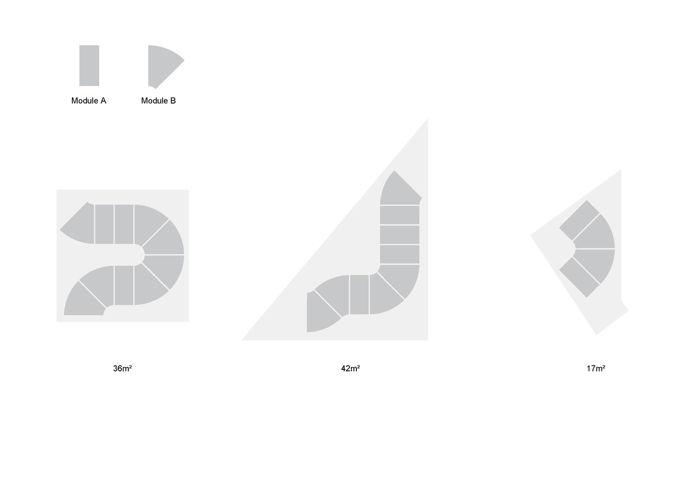 Two types of modules
 A park as the site (cr: half.half.photography)
The store has two primary modules: a straight one with 0.9 meters length and a curved one with a 22.5-degree turning angle. Both types are 2.1 meters wide and 3.6 meters high. The dimensions emerged from the space capacity needed to accommodate coffee makers, grinding machines, fridges, and other equipment.
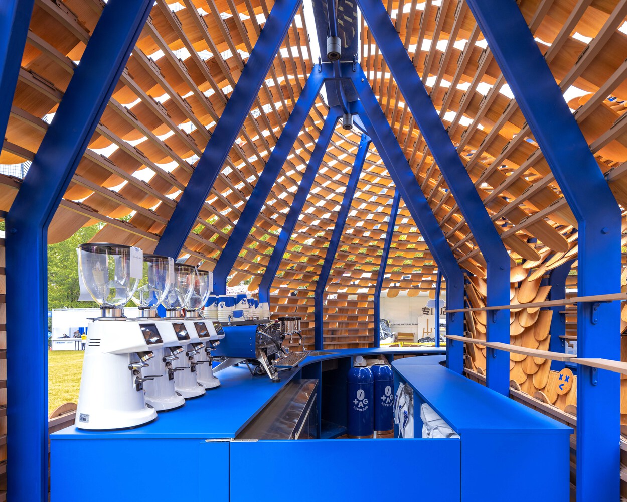 The equipment inside (cr: half.half.photography)
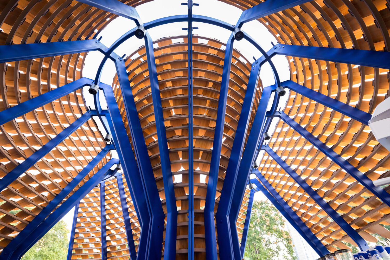 The steel frame (cr: half.half.photography)
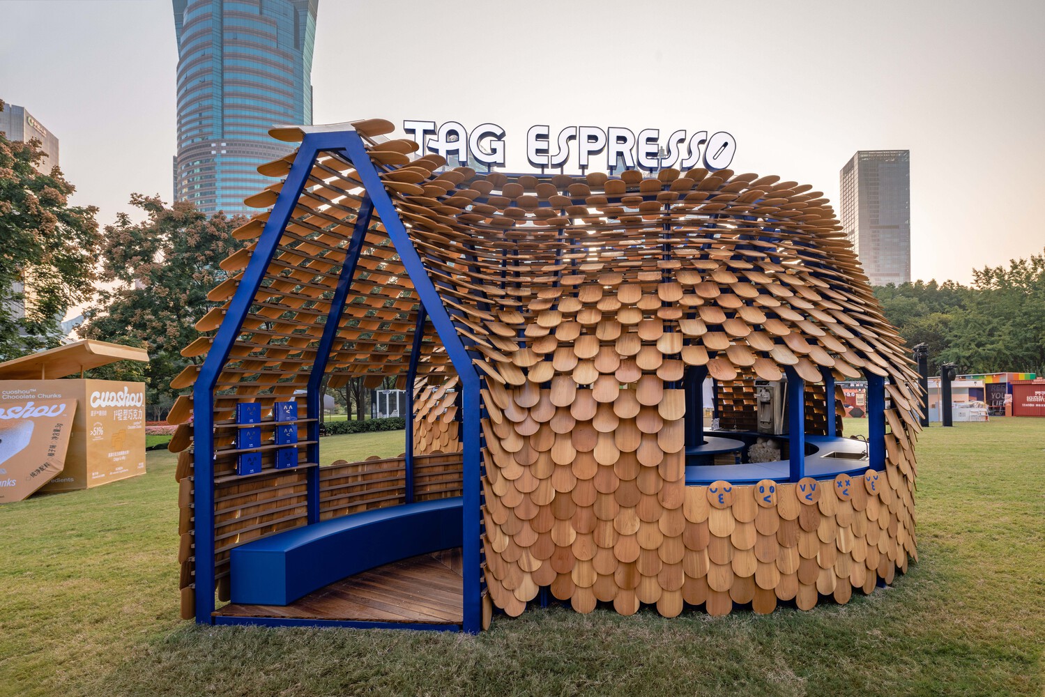
The installation’s main structure is formed by steel tubes that can be installed on-site using screw bolts, which was inspired by Jean Prove—a French architect known for blending architecture and engineering as well as the pioneer in prefabricated housing design. The tubes create the “outline” of a house which is then covered in red cedar—a common roofing material—that tilted gradually from bottom to top on the outer layer. To further emphasize the cartoonish brand identity, the frame is painted in the signature blue color, and some tiles are decorated with emoji stickers.
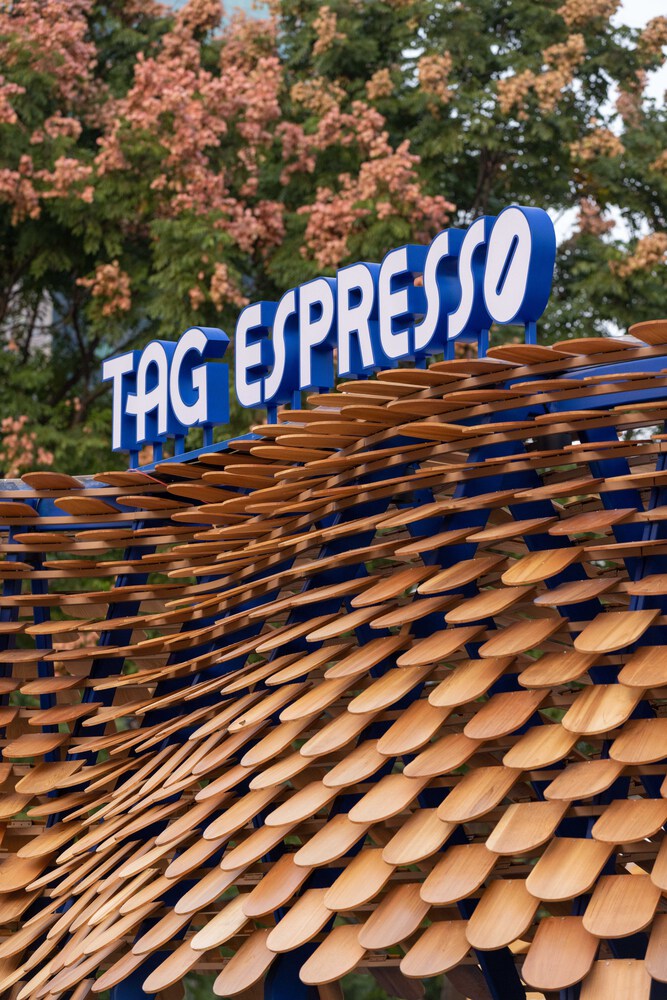 Red cedar as outer layer (cr: half.half.photography)
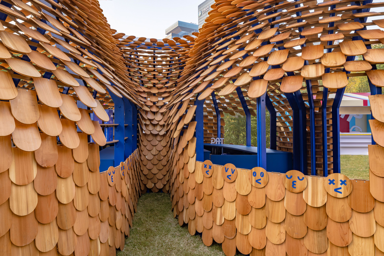 Emoji stickers and signature blue color (cr: half.half.photography)
In the context of the Lujiazui Coffee Festival, at first glance, the TAG Espresso’s kiosk looks like a scaly pangolin curled up in the middle of a lawn—a curved volume covered in wood fragments all over the surface. Here, the brand got 36 square meters of space so the shop is structured using three straight and seven curved modules. These modules are arranged in a free form with a U-turn-like formation to provide access to engage with customers from all sides through openings in each direction. That way, interactions between the brand and the community will be more dynamic, and not limited to the one-point counter concept.
 Structural detail (cr: half.half.photography)
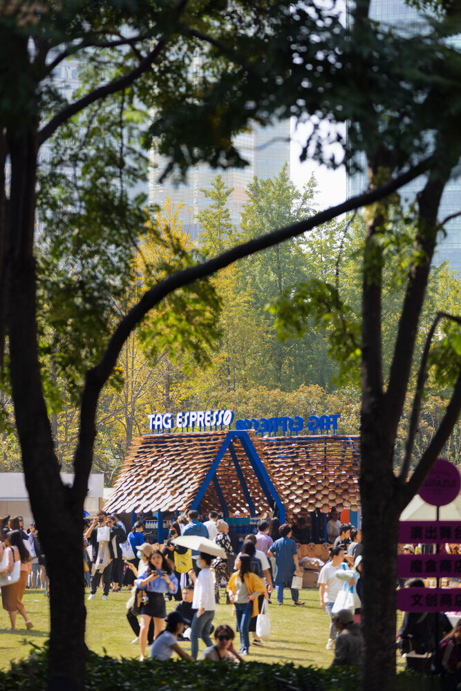 The store and its interaction with the community (cr: half.half.photography)
Shortly, modular structures that are easy to arrange and can be used repeatedly with several possibilities of flexible layout variations will likely become a necessity for entrepreneurs to make them possible to open attractive and sustainable pop-up shops.





Authentication required
You must log in to post a comment.
Log in