"Hyper Slow" Concept at Burger Restaurants in Seoul
With the motto "FAST FOOD BURGERS. SLOW FOOD VALUES", this San Francisco-based burger brand opened a branch in Seoul, South Korea. The purpose of the motto is to create an atmosphere of relaxed life amidst the hustle and bustle of crowded activities in Seoul. As the architectural firm appointed to design the store, Betwin Space Design created an interior with a concept called "Hyper Slow" by blending fast food and the idea of living slowly. With a slogan on its façade, the store's main entrance is orange like a sunset in San Francisco, raising customer expectations of the Super Duper Burgers brand.
 Façade of Super Duper Burgers Seoul
Upon entering inside, a space connecting the outside of the building with the inside, orange on the walls and ceiling, is equipped with posters and photos of the shop's signature menu, the burger. This room is semicircular that visualizes the sun about to sink at dusk, appearing halfway on the earth's surface. Here customers can place orders independently through the two automatic order machines provided.
 A Room That Gives the Impression of a Sunset in San Fransisco
If visitors need help placing orders independently, customers can go to the cashier counter inside the first-floor dining room. In this area, the shape of the cashier counter is designed circular with a metallic finish illuminated by strip lights. When entering this area, Betwin Space Design creates a futuristic retro atmosphere that attracts visitors. The first floor emphasizes high-tech futuristic visible from the metallic floor, walls, and ceiling and presents the brand color through orange acrylic. The future-oriented atmosphere is also supported by artificial lighting that shows the San Francisco sunset shining into the space where the intense contrast of gray and orange is combined.
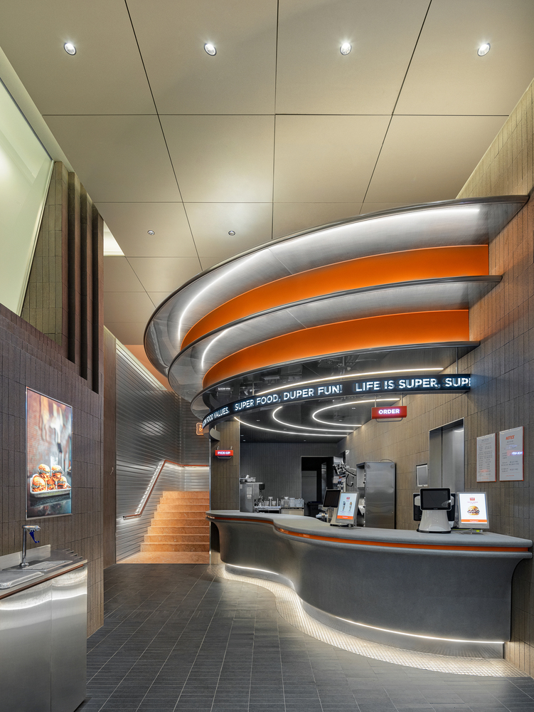
The Order Counter of Super Duper Burgers Seoul
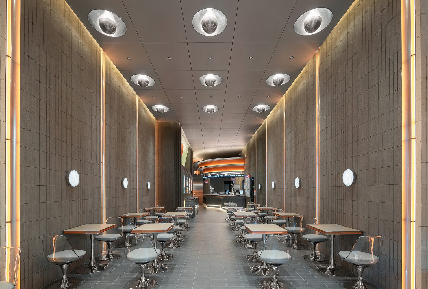 Dining Room on the First Floor of Super Duper Burgers Seoul
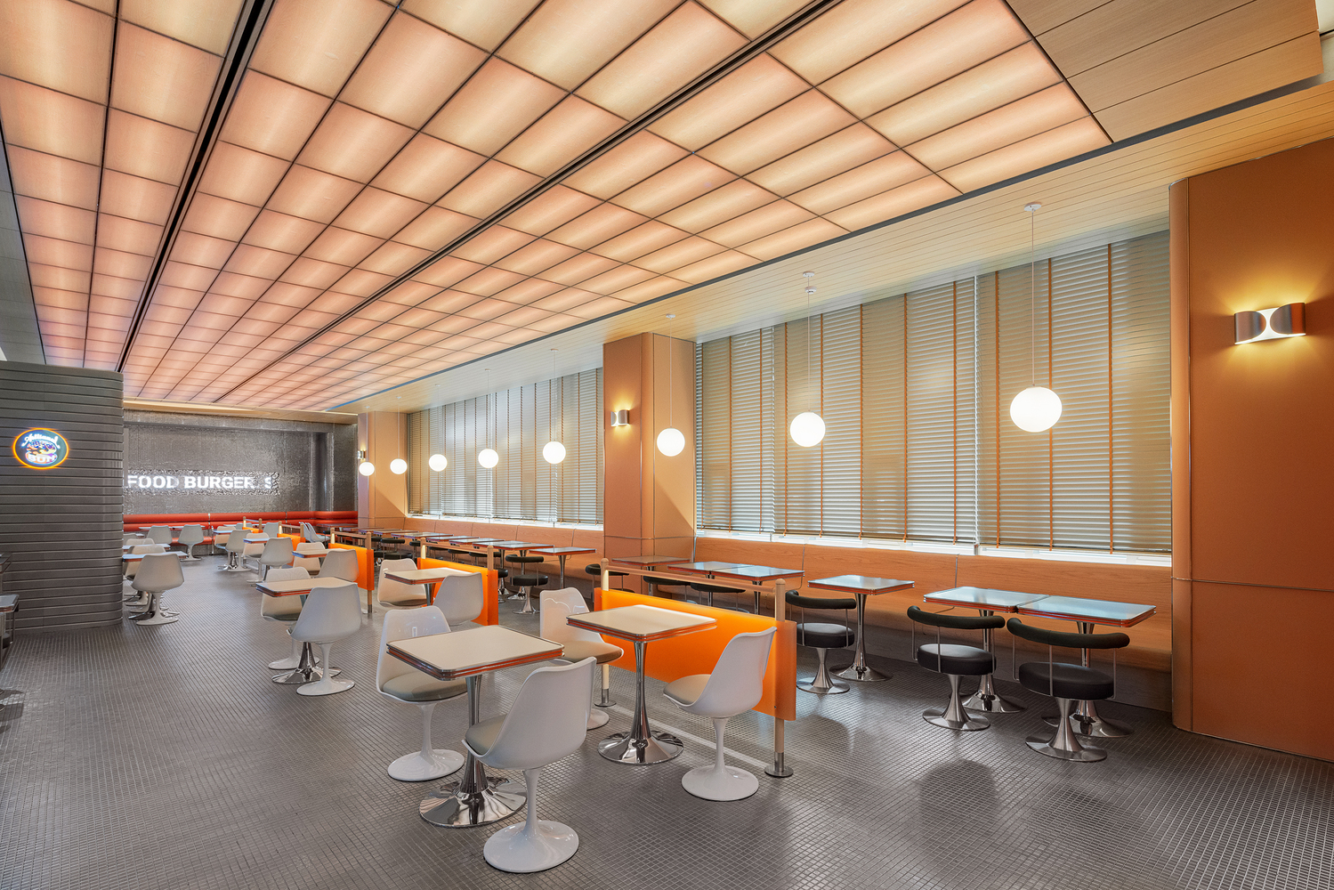
On the second floor, where a futuristic retro atmosphere can be felt because it uses an aluminum extrusion blade module that embodies the trailer shape commonly seen in American eateries. This dining area is equipped with a built-in long orange stool with soft sponge material and a white chair table. Behind it is a metallic wall that says Super Duper Burgers. In this room, customers will feel a comfortable dining experience because of the furniture layout that considers circulation.
 Retro Atmosphere on the Second Floor Dining Area
The second floor presents a futuristic atmosphere through metallic walls, floor finishing, and the use of furniture. With lighting behind a grid-patterned ceiling and a ball-shaped chandelier, this room at the same time presents a warm and relaxing atmosphere to enjoy a slow time. Customers can also choose a seat as comfortable as they are in the middle of the room or facing the window.
 The Interior Design on the Second Floor
 Dining Room on the Second Floor of Super Duper Burgers Seoul
Seen from the layout of the first and second floors, designers apply a simple floor plan shape with linear circulation. The layout of the space is adapted to the essence of commercial buildings selling food and beverages. One of the hallmarks of this building is that it has a dining area on the outermost part and is equipped with a booking counter in the inner area. This arrangement aims to accommodate customer activities starting from coming, choosing menus and ordering, waiting for food to be served, and ultimately eating the food. The atmosphere of the presented space allows customers to feel comfortable and relaxed in accordance with the concept they want to highlight, namely "Hyper Slow".
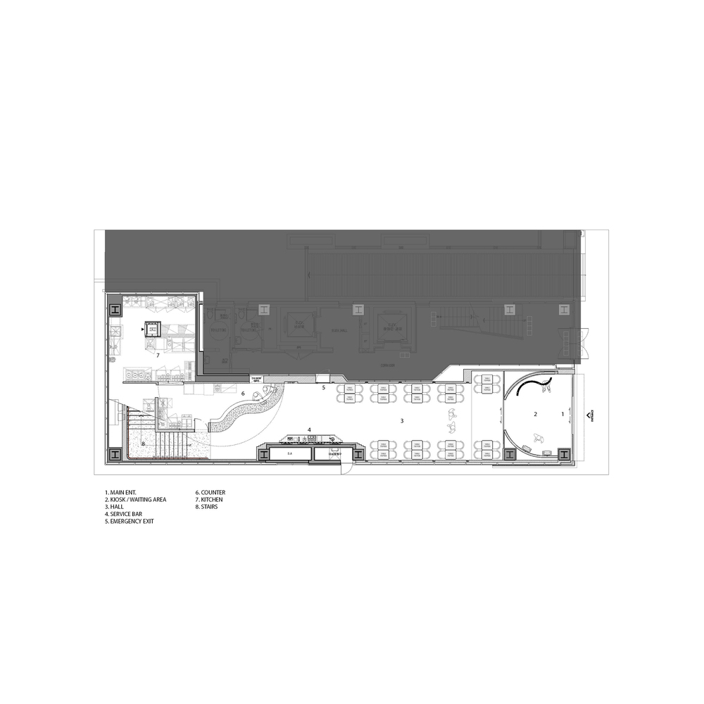
First Floor Plan of Super Duper Burgers
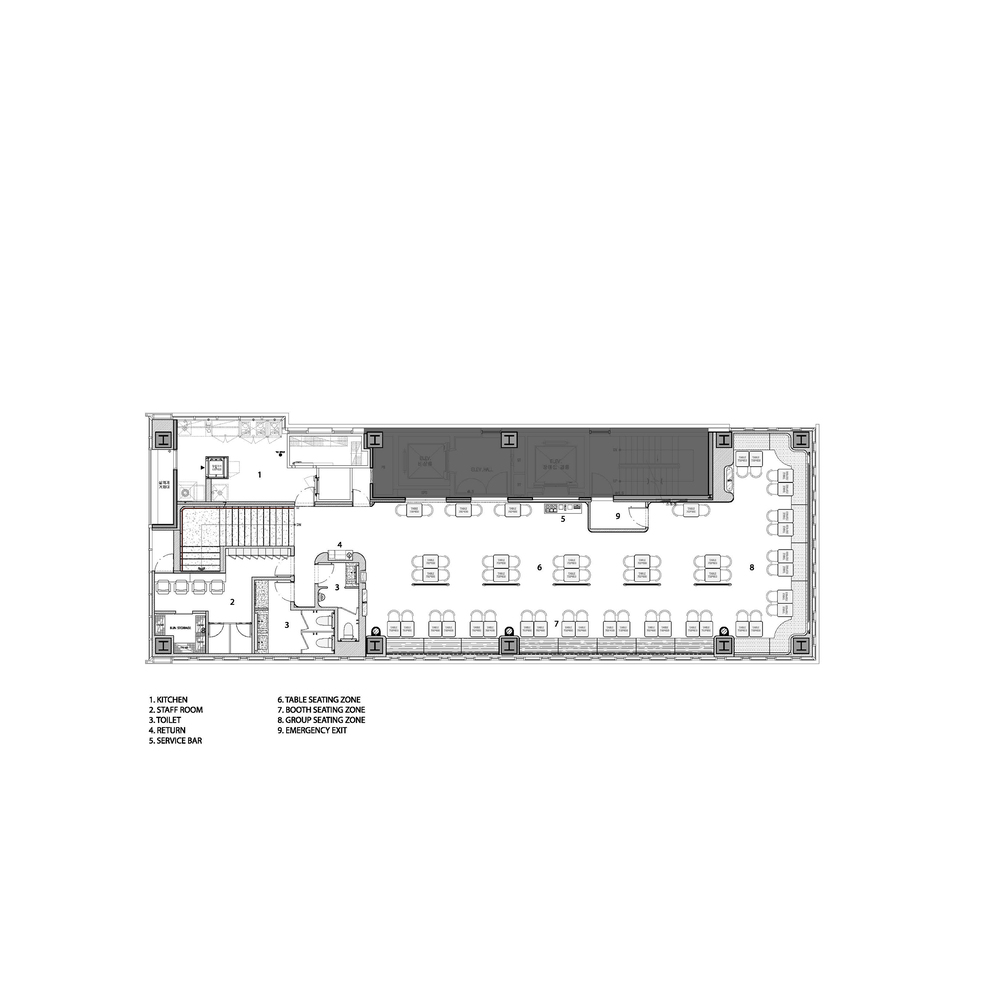
Second Floor Plan of Super Duper Burgers



Authentication required
You must log in to post a comment.
Log in